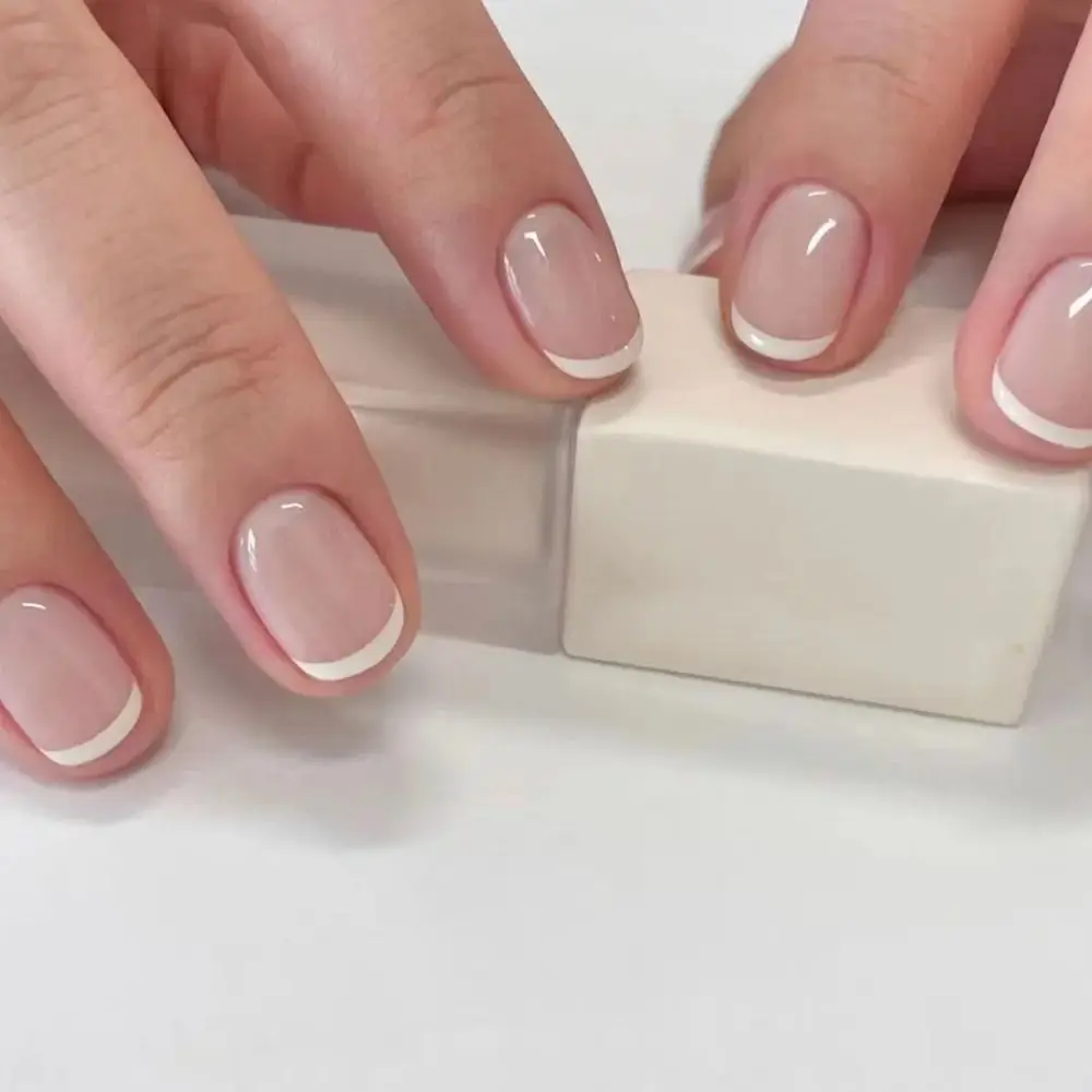
Thin and bold French tips use the same basic idea—a contrasting line at the free edge—but the width of that line changes the balance of the whole manicure. A thin tip leaves more of the base visually dominant. A bold tip gives the free edge more weight.
Thin French tips keep the line restrained
A narrow tip can make the design feel lighter because the base color occupies most of the visible nail. On shorter nails, even a fine line can still be noticeable because there is less total surface area.
Bold French tips make the free edge a feature
A wider band creates stronger contrast and can make the tip shape easier to see. On square nails, it may emphasize the straight edge; on curved shapes, the line follows that curve more visibly.
| Feature | Thin tip | Bold tip |
|---|---|---|
| Visual emphasis | More attention stays on the base. | More attention moves to the free edge. |
| On a short nail | Can look compact and delicate. | Can occupy a larger share of the visible nail. |
| On a long nail | Can leave a larger uninterrupted base. | Can create a stronger two-part design. |
| Main comparison question | How subtle do you want the line? | How much contrast do you want at the tip? |
Length changes the proportion
Tip width is easiest to judge as a proportion of the whole nail. A line that looks bold on a short nail may look moderate on a much longer one.
When comparing product photos, look at the entire nail rather than the tip alone.
Base color changes the contrast
A white tip over a sheer pink base creates a different contrast from the same white tip over an opaque nude or deeper base. The French line is only one part of the color design.
Shape changes how the line reads
Square, rounded-square, oval and almond tips give the same line different geometry. If you are deciding between square families, the rounded-square vs. square guide helps isolate the corner shape.
Use real examples rather than relying on the label
“Micro French,” “classic French” and “bold French” are not perfectly standardized measurements. Product photographs are more useful than assuming every seller uses the terms the same way.
The short French-tip guide gives a broader way to compare base color, tip, shape and length.
French vs. solid is a separate decision
If you are unsure whether you want a tip line at all, compare French-tip vs. solid-color press-ons first. Then return to line width once French is clearly the direction you want.
Choose the visual hierarchy
- Pick a thin tip when you want the base shade to remain the main visual field.
- Pick a bold tip when you want the free edge to become a stronger design feature.
- Let the exact product photo decide when the label and the visual impression do not match.
After style selection, confirm fit with Find Your Fit.
The conversation